 |
| Wombo's a rocket ship! |
I
teach computer technology in my day job and I've watched the coming of
artificial intelligence over the past decade with interest.
AI and machine learning is getting better at managing real world data like visual information. Recently, a
Canadian company named Wombo have created an abstract art creation tool that builds original images from some key words and a selected art style. This AI art generator offers some interesting insights, especially in a world where branding is everything (such as in motorcycling).
Wombo (https://www.wombo.art/) is easy to play with - just throw some key words in and pick a style and you get an original piece of abstract art. If you run the same information it comes out different each time too.
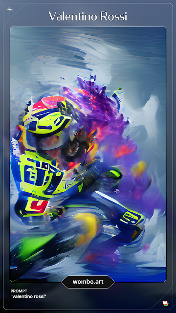
So, what to throw in first? Valentino Rossi, of course - he's front and centre in many motorcyclist's minds this fall.
The machine intelligence putting this together has scanned every image it could find of The Doctor. It creates its own contextual understanding from that massive dataset. It doesn't understand who Valentino is (though it might have scanned articles about him for keywords and have used that too). These randomized but thematic pieces makes some interesting inferences. Firstly, Valentino means high-vis yellow... and Yamaha blue. This begs the question: "what were Yamaha thinking sending Valentino off to retire in teal and black?
Perhaps my favourite part of this piece is the obvious
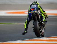
Doctor's Dangle happening. The dangle was started by Valentino around 2005. It's still a bit of a mystery how it makes you go faster, but I suspect it offers a bit of fine tuning on your balance under heavy breaking while also offering a bit more wind resistance to slow you down. Wombo's algorithm won't know any of that, but it knows to associate the dangle with the man who invented it. At least it did this time, every other time I tried a Rossi image it wasn't there.
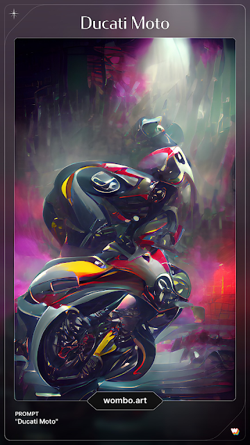
The Rossi implications got me thinking about how a machine intelligence sees a brand... and what interesting conclusions you might draw from it. Ducati got the first swing at it since they're such an iconic brand:
The colours certainly shout Ducati, and while the motorcycle isn't obvious, there is something about the lean that suggests two wheels. If someone who'd never heard of Ducati were shown this, I suspect they'd consider it a sporting brand rather than something else like a heritage focused company. I think they'd be happy with that.
I then threw Triumph into the mix:
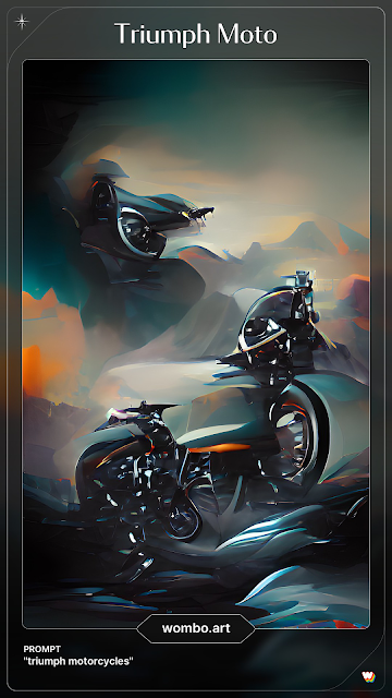
Not sure what to make of that one! Triumph's long history before its resurrection must make for interesting texture in the data. This looks very art deco and feels like 50s and 60s advertising might have inspired it. Once again, the idea that Triumph is tied to motorcycles is evident in the edges, especially the one middle right.
Just now I did two more "Triumph Motorcycle" renditions:
I still see bikes (but then I tend to see bikes). There is a sense of speed in how the designs depict the abstract objects. I can't help but wonder if the colour choices aren't from actual bikes.
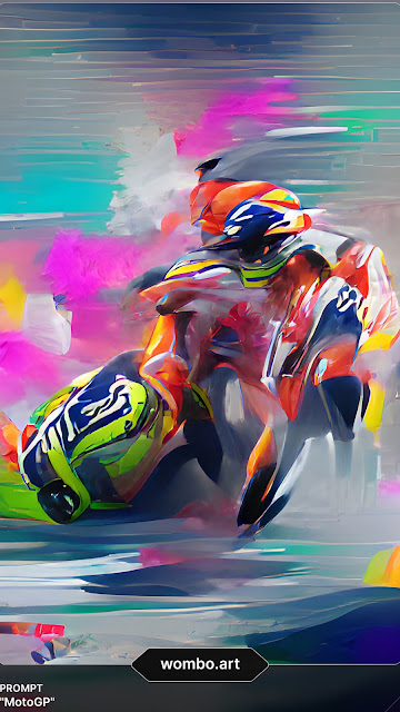
Here's one for MotoGP:
I can almost see Marc Marquez and Valentino Rossi in that. It certainly contains a feeling of competition and speed. Does the machine intelligence know who Marc and Valentino are? Is this an echo from
Sepang in 2015? I wonder if that'd make anyone wince in MotoGP's marketing office.
Wombo's AI art generator is easy to get lost in. The images seem to speak in surprising ways. If you've got a minute, go play with it.


